Creative Field
Branding
Tools


Duration
Semester Project
SS 2023
Team
Vanessa Saouda
Janna Hoogestraat
About
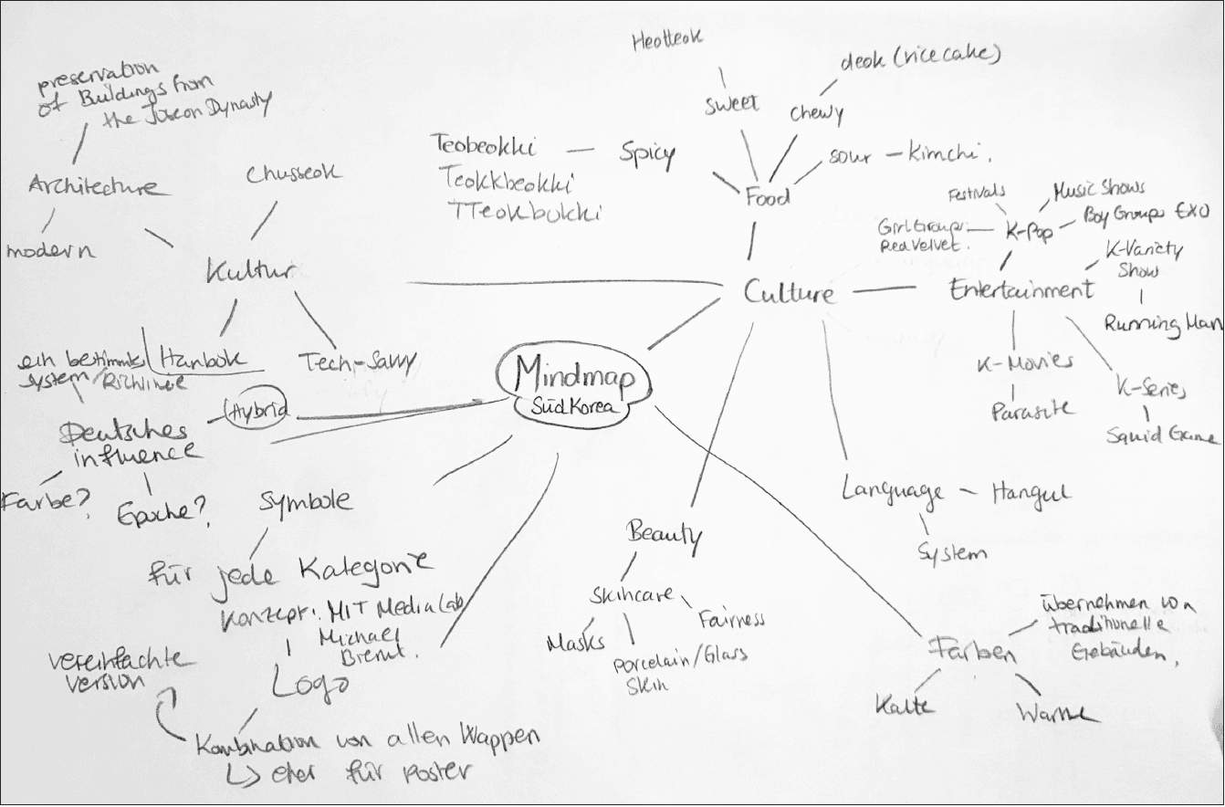
In the Brand Identity course, we were asked to develop a new corporate design for an event that would be adaptable to a variety of media and applications. It was possible to create a redesign for an existing event, but we decided to create our own event from scratch, which would promote cultural exchange between South Korea and Germany in the form of a pop-up store.
Focus
Typography
Titles
Text
Highlight
(Pretendard Light)
타이틀
ㄱ ㄴ ㄷ ㄹ ㅁ ㅂ ㅅ ㅇ ㅈ ㅊ ㅋ ㅌ ㅍ ㅎ
ㅏ ㅑ ㅓ ㅕ ㅗ ㅛ ㅜ ㅠ ㅡ ㅣ 0123456789!@#$%^&*()><
텍스트
하이라이트
(Pretendard Light)
Palette


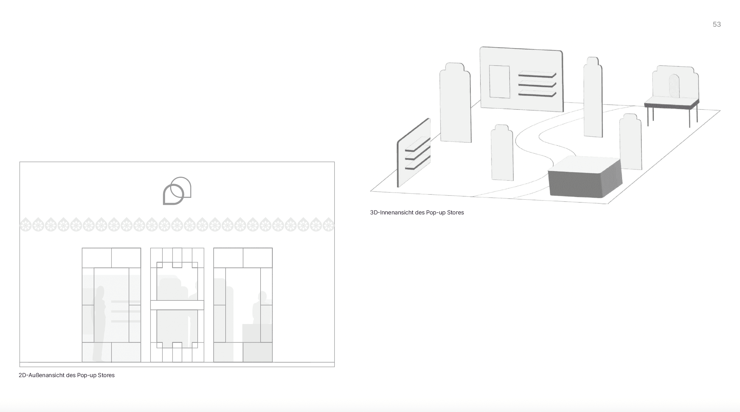
Pop-Up Store
The outside of the store features the logo. The interior of the pop-up store is based on the six thematic areas. The layout of the space is non-linear, which means that everything is open and flexible. There are various shelves and tables on which the products are displayed. Large information signs guide visitors through the different areas and provide a good overview of the pop-up store.

Posters

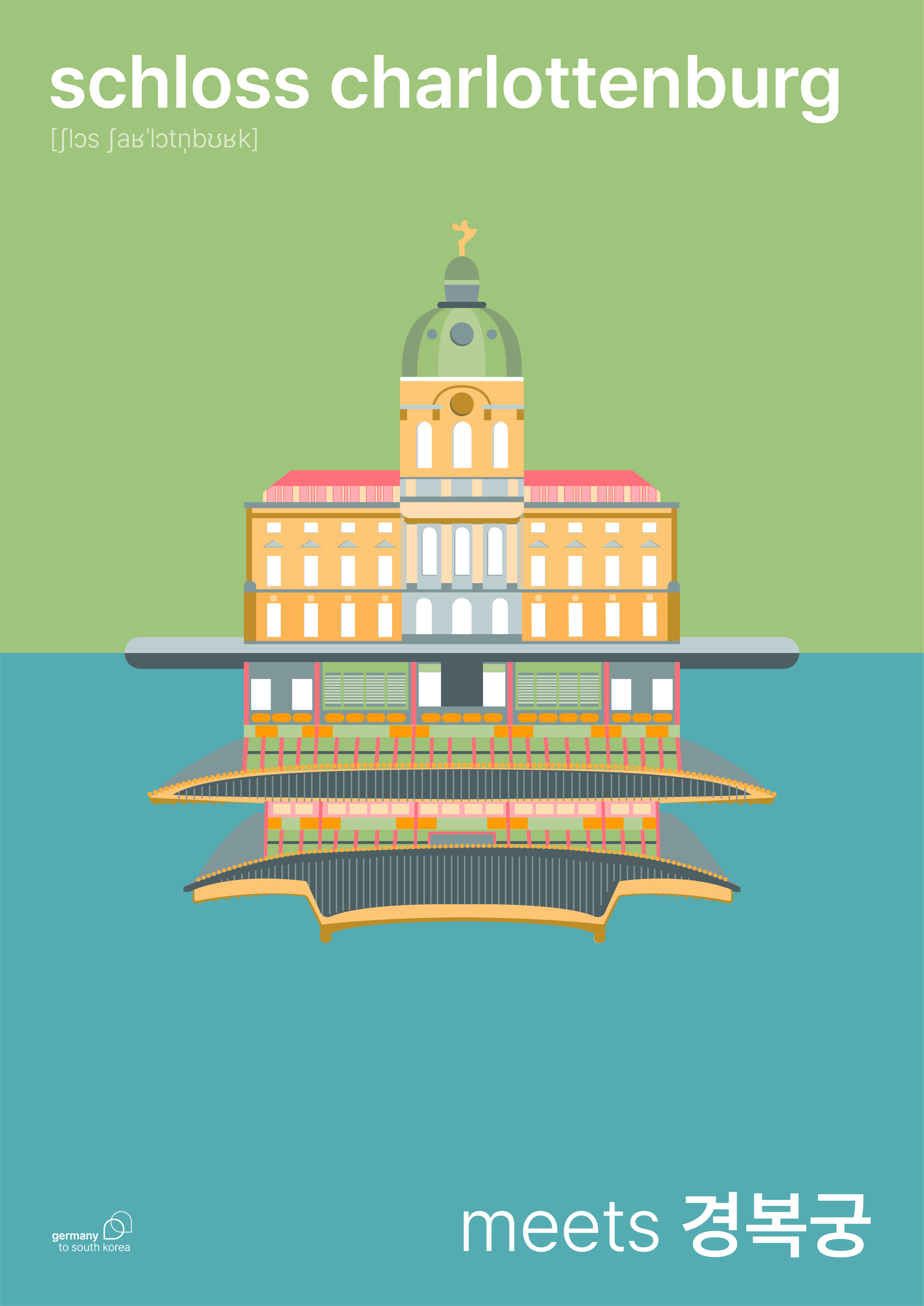


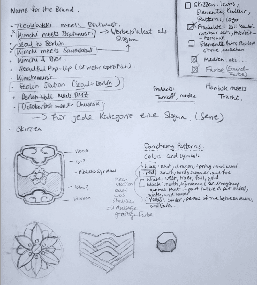
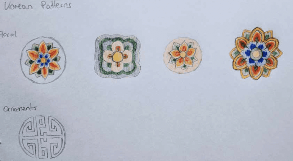
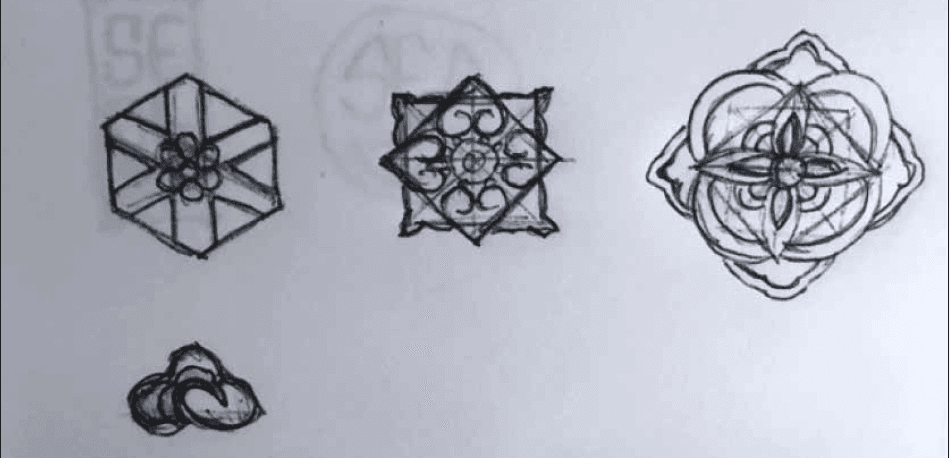
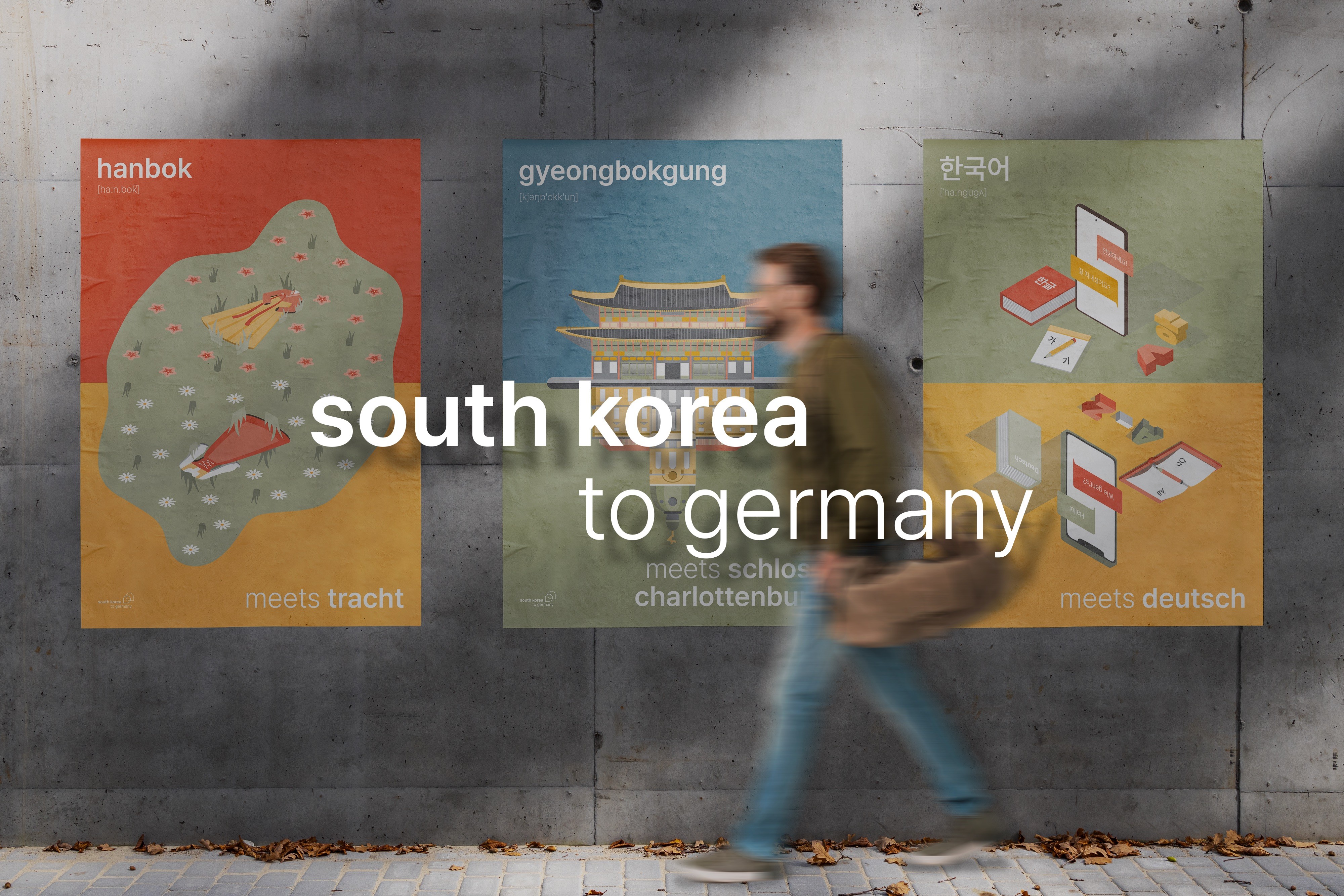
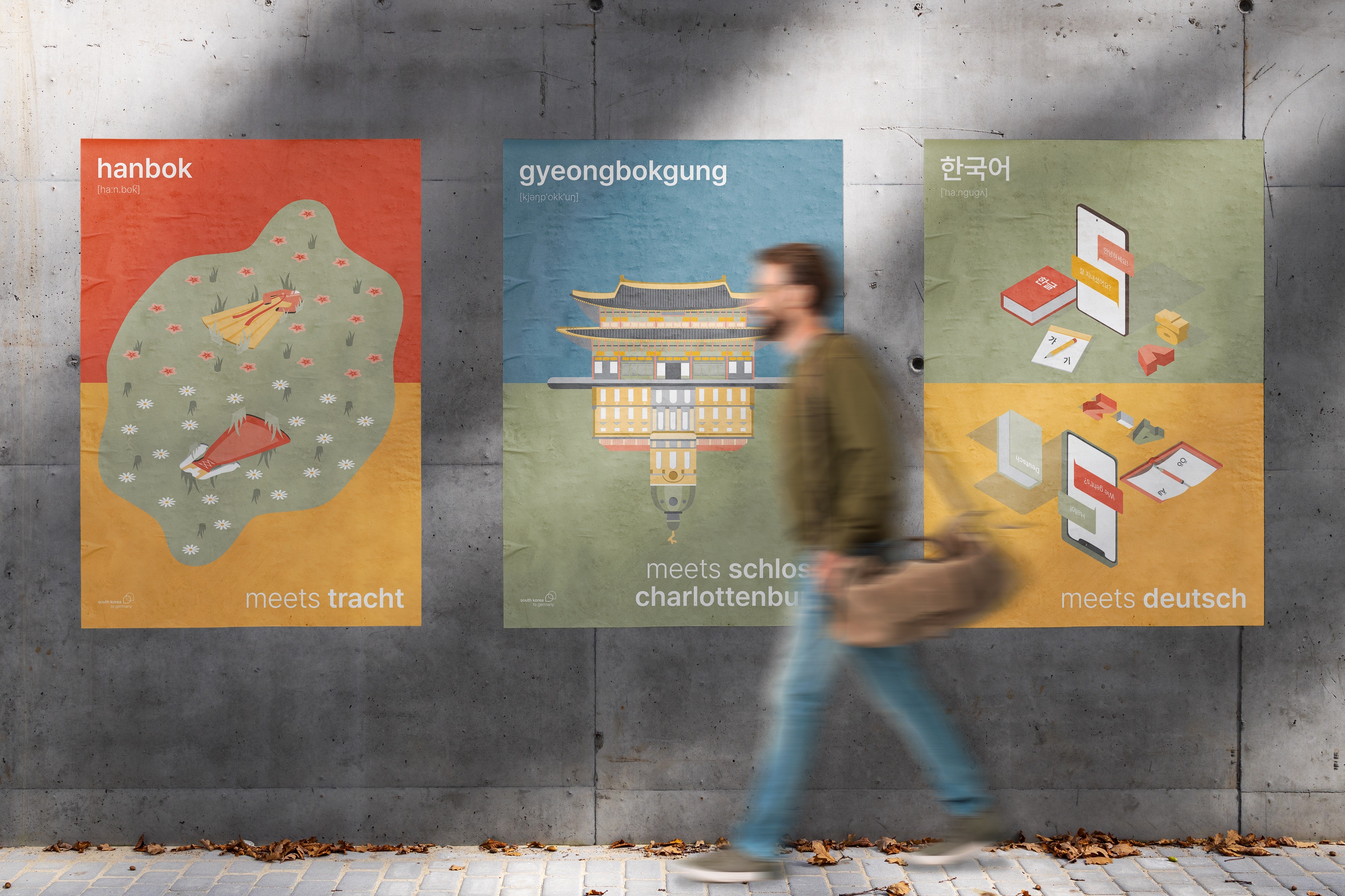
Illustrations representing both countries come together in a unique parallelism, where the elements from their respective categories meet in a harmonious fusion.
Poster decorating the streets of Germany.
Merchandise
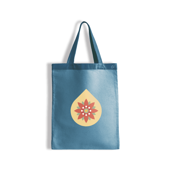
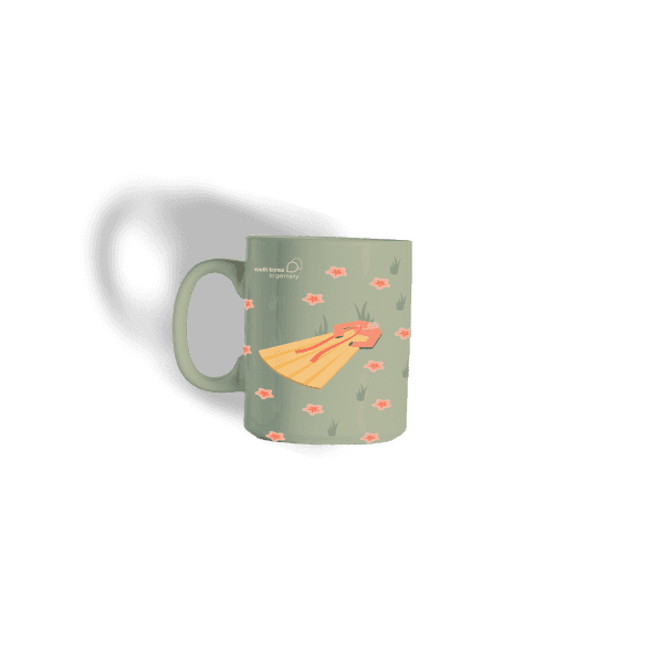

Merchandise Preview
Packaging Design


Packaging Preview
Paper Mockup

Process